[Music/Graphic Design] Erikoismerkki Kirjasuunnittelu / Special Character Book Design

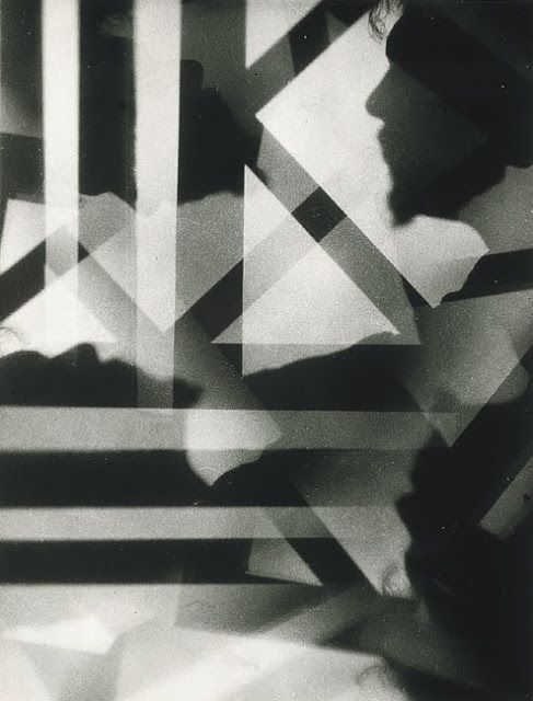
I run into some truly kind, rather brilliant artists constantly. I wanted to give a heads up to designer John Hubbard’s website. Here’s a bit more about his work:

A professional book designer since 1994,
my emphasis is on illustrated art catalogs,
photography books, and elevating music
packaging to book form…
along with designing record albums,
CDs, DVDs, film posters, children’s books,
cookbooks, and so on.

With my situational approach to design,
a great love and knowledge of typography, color,
and printing, I will  translate your ideas 
into a thought-provoking
professional publication.

Our collaboration will generate a new juxtaposition
of ideas, providing balanced and engaging form
to your content.

My personal interests extend beyond books
to photography, music making, and enjoying
the sights and sounds in between.

After a lifetime in Seattle,
I now reside in central Finland 
with my wife and daughter.


Thank you for looking.

John Hubbard

 B O O K  D E S I G N E R   /   C R E A T I V E   D I R E C T O R

What is particularly pleasing to the eye is his music design, which you can peruse here. Consider supporting his work.

[Music/Video] Chris Trull


I am very proud to introduce my cousin, Chris Trull, to my friends and connections!  He’s blossomed into a hell of a video producer and photographer, and if you’re looking for someone to do a music video for you, especially if you’re into things that lean more towards prog, grunge, and even psychedelic music, Chris is your man!

[Photography/Literature] Nuno Moreira (Photography) – Zona

01_800

Black and White. The power these non-colors have on our eyes, our imagination, are difficult to pin down. Vincent Van Gogh found it necessary to master these two tones before feeling comfortable to work with his legendary splashes of color. Such is the importance of these striking tones.

Nuno Moreira works in the realm of photography, but his art is no less striking than the great Dutch master’s work. His new book, “Zona,” is a meditative exploration on how (non-) colors, text and black and white images work together in a seamless fashion. The cover itself starts the experience of this book out quite nicely.

In an age where digital reading material is the norm, it is a wonderful sensation to feel the coarseness of a well-done book cover. As each page passes, one can choose to meditate on the stark tones inside. Text written by José Luís Peixoto give one pause to drink in the meaning of these words (in Portuguese, English and Japanese).

More on Nuno’s eye. Perhaps referencing the Dutch Masters is a bit off. There is something more searing about black & white, something more otherworldly, a better way of telling a story, a way of acclimating movement, curve, form, to text. The models use simple movements – a touching of a shoulder, the extension of a hand… Much like in the altar of a church, or in the making of icons, there is absolutely no detail that is superfluous. Through simple movements, Nuno and José Luís play off of each other. The words are few, yet the stories told here are quite deep.

I can’t say I’ve come across such a work before. It’s a perfect meditative tool for me, and I say this as one who comes from a background steeped in icons, ‘Jesus’ prayers and a wonderful sensory overload which inspires calm. The contrast of powerful images separated by black or white pages gives one an opportunity to truly drink in what one has seen, and then move on to the next image, fully satiated. It is a masterful work, and a rare opportunity to ‘borrow’ the eyes of a visionary.